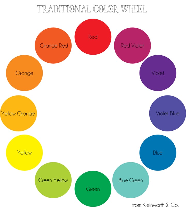
Staging your food photography images takes far more work than it truly looks like when everything comes out in the post. But that’s how it’s supposed to be. If you do too much – it can be quite obvious. There are also some that prefer a simple approach to their food shots- which can be quite beautiful. I sometimes go that route – depending on what the dish is. However- I typically like to set up my shot to look as “normal” & “true to real life” as possible. When doing this it’s good to have things set up with your subject that you would normally have with it when serving in real life. Things like napkins are almost always present in my house when eating anything. But the key here to making your food pop in your images is to use those things like plates & napkins compliment or contrast in color to give visual interest. I decided to create this Color Wheel Printable to help you choose what colors work best in your prop selection. Free Printable Checklist Templates
The key here is to choose props that are across the color wheel. Your primary colors will be red, blue & yellow. All other colors are made from a combination of these colors. Then your have your secondary colors – green, orange, purple. Then there are the variations in between. I typically choose directly across the color wheel – unless it’s red or green & it’s not Christmas time. Sometimes I abandon the idea of going across the wheel & will choose from a color family instead. The key here with the wheel is to find colors that pop against the colors you already have in your subject.
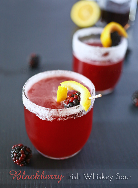
Like in this Blackberry Whiskey Sour– because the color of the drink is a red violet color I used the yellow of the lemon twist to really pop the drink & bring more visual interest.
If you look throughout my blog you will see more & more examples of either contrasting or complimenting colors between the dish I am showcasing & the items styled around it. Download & print the color wheel for future reference when going forward in your food images. Sometimes just seeing the colors together can give you enough inspiration to help you pick your props & really make your images great.
Want More Food Photography tips?
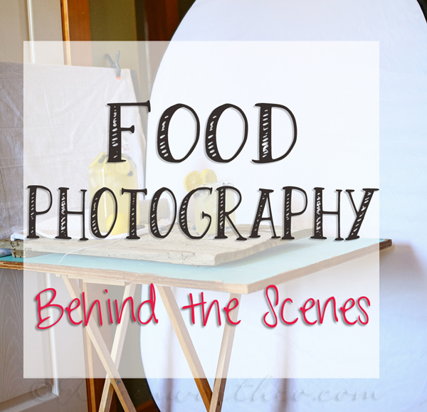
Food Photography Behind the Scenes
To see where I am linking today- visit HERE


What great tips! The color wheel is a work of art all by itself!
This has been my biggest challenge. I really have a difficult time with brown foods, the ones that taste the best.
Madonna
Brilliant, just like a true artist!
I am stunned. I knew all about complementary colors and use them frequently for other purposes. Why did it never occur to me to use this tip with food photos? Thanks so much, Gina!
Great info! Lovin’ this color wheel. 🙂 Thanks for linking up at Sunday Soiree!
I am just learning about this in a course I’m taking…this is a great visual that will help with this. Thanks for sharing!
This is so helpful. Thanks for the tips! Pinned!
So happy that it helps Blair!!